Catalogue design

Pasta Fabriano

Pasta Fabriano was born from the union of four friends, even before being partners, united by their love for the city of Fabriano and the Marche region. The goal is to create a high-quality, artisanal product that tells the story of the territory through the raw materials used.

My task was to create a product catalogue in line with their ideas and which presented the pasta at its best.

Marche region
Marche region
Eggs
The raw material: eggs
Pasta
The result: pasta
Cover of the catalogue designed for Pasta Fabriano.
Opened catalogue designed for Pasta Fabriano.
Pages of the catalogue designed for Pasta Fabriano. There are two images of the pasta.

FEATURES

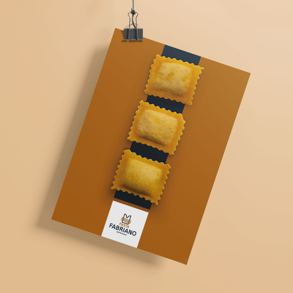
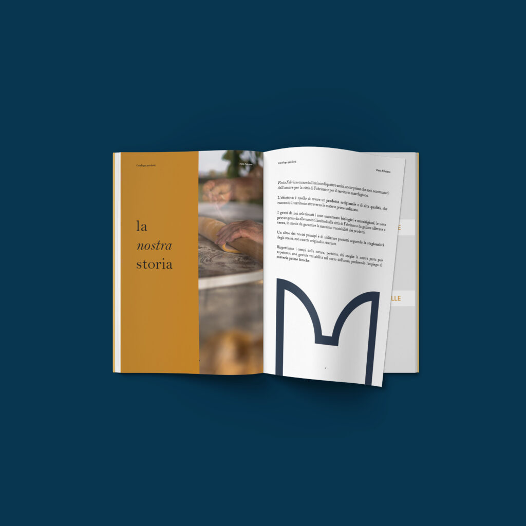
I chose to use the colours of the logo and to exploit geometry (bands, stripes, squares…) to scan the pages.

The gold colour fits the product perfectly, recalling the pasta itself. I also added a light grey to make the background of the photographs more elegant.

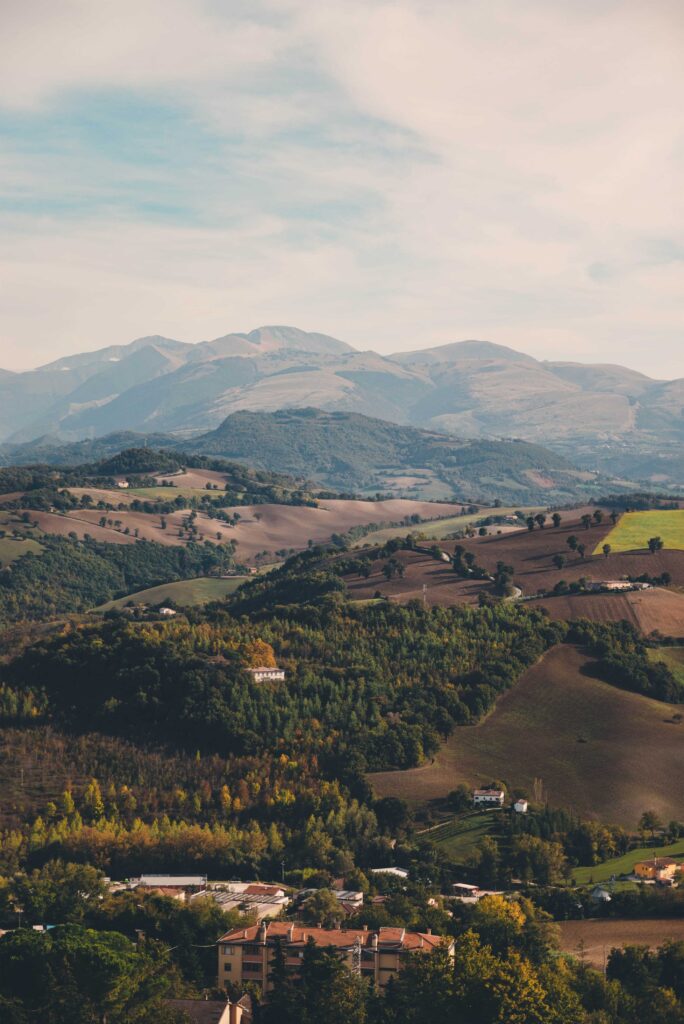
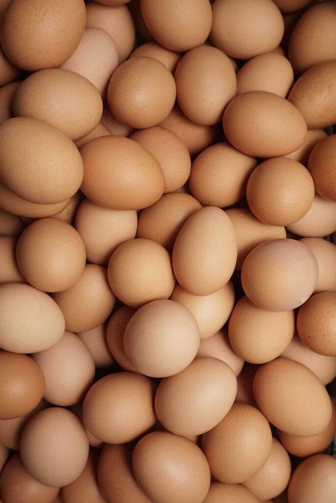
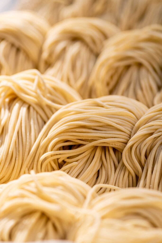
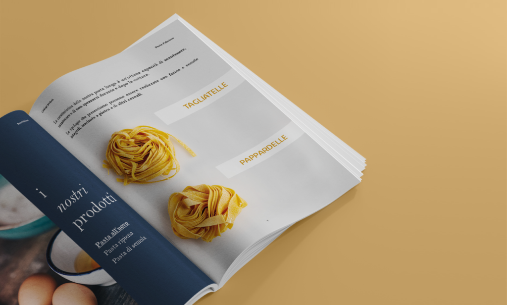
The images chosen are those of the Marche region and the preparation of pasta. Graphically, the logo symbol, a stylisation of a Fabriano monument, can also be found.

#273547

#c98b2d

#d6d6d6