Brand Identity

DC group, massimo vantaggio competitivo

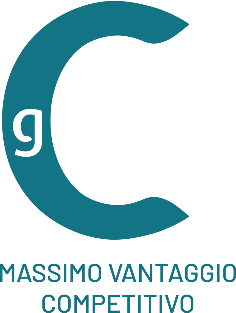
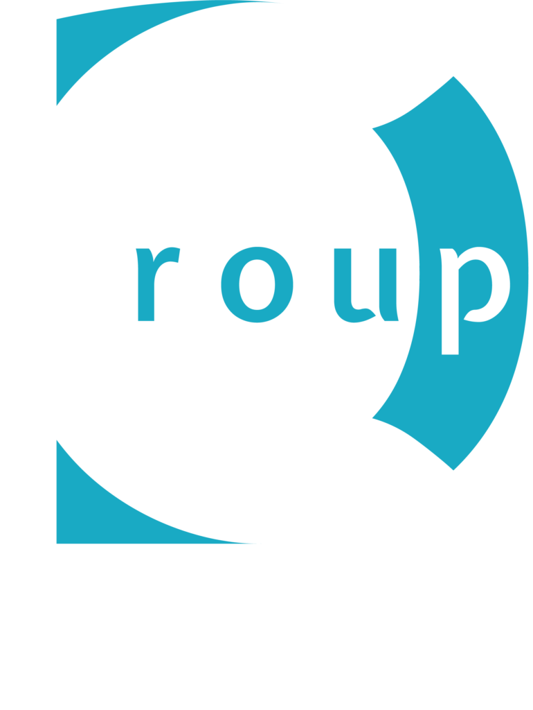
The DC Group identity expresses digitisation, competence, multichannel and speed. For this reason, the restyling of the DC Group Logo includes a graphic with sinuous lines that – with its “cuts” – conveys the idea of movement.

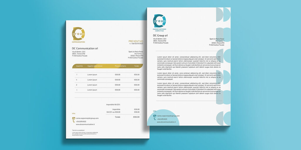
The strength of the new Logo lies in the company’s declinations: by changing a few traits – such as the colours and the claim – each company acquires a strong identity, without losing its belonging to the group. Thus DC Communication, DC Healthcare and DC Ecobuilding were born.

New logo of DC group with claim.
Precedente
Successivo

COLOR PALETTE

Colour palette representing innovation from the book Worlds Favourite Colour Report – G.F Smith. For each shade, a light and a dark version is used.

#24aac4

#197385

#d4ae2b

#9f8630

#e05626

#93301f

#028374

#035047

Expletus Sans font.

Sans serif font

Two fonts were chosen: Expletus Sans (main) and Barlow (secondary), both Sans Serif. The first one has very distinctive lines with a strong character. Barlow is less impactful and allows some of the intensity of Expletus Sans to be discharged.

Two papers with new Brand Identity Design of DC group.

Graphics

The main graphic element is formed by a line with its ends tapered and circumscribed in a quarter of a circumference. This feature stems from the ends of the letter C in the logo.
All secondary graphic elements are derived from this line.

DC group's coordinated social image.

Icon set

The icons for the visual identity were constructed from individual graphic elements such as line and circle. Between each element is a space the size of ⅔ of the space between the ‘D’ and ‘C’ of the logo.