EO is an agency that deals with websites, SEO, graphics, photography, social content… In short, everything related to digital design.
The colours chosen for EO are part of the bronze world. The customer finds himself very much in this metal.
#8B7C6E
#4c3429
#7B6D62
#f4e4da
When overlapped, the letters ‘e’ and ‘o’ create the at sign. What other symbol can best represent the web design?
The at sign was then adapted to the circle. Today in social networks, this is the most suitable form.
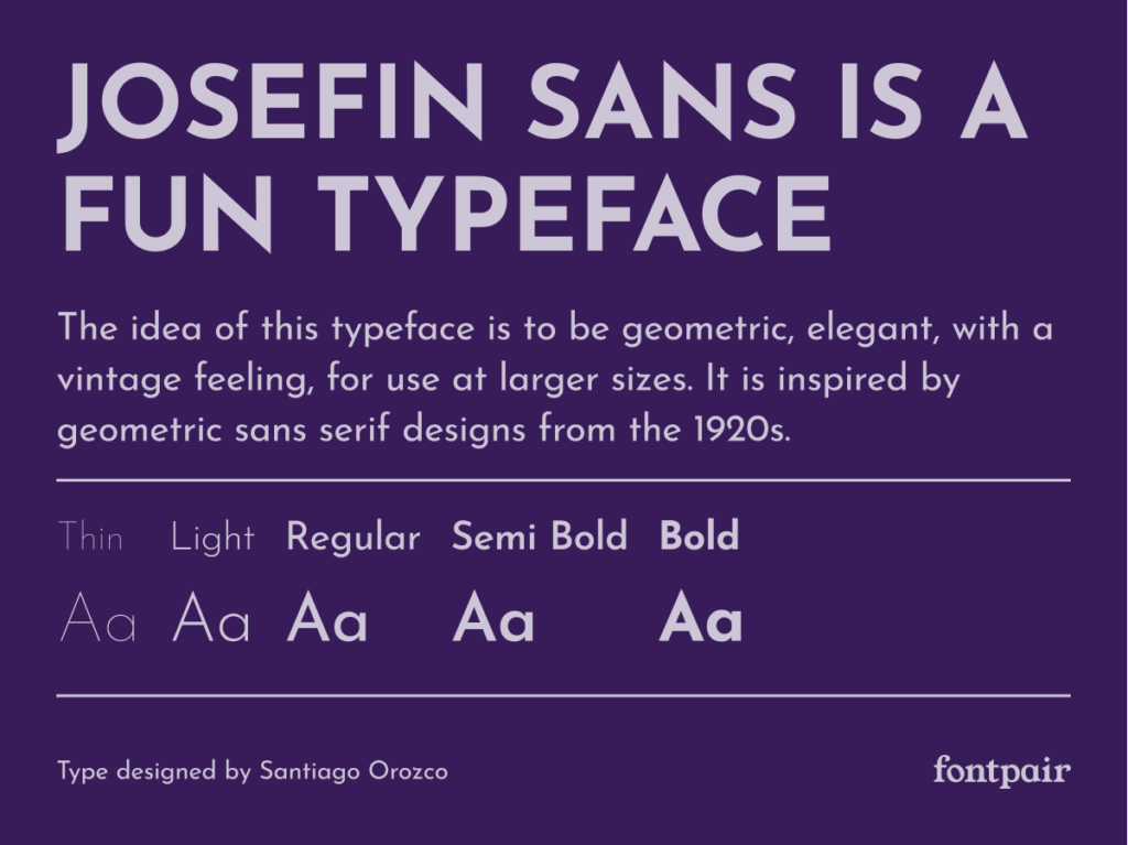
This extremely clean font was chosen for the claim to give prominence to the monogram. Two different weights were used to aid readability.